
Here's 3 things you need to get sorted to create SLICK, BALANCED layouts in your designs
This morning I was finishing a workout class and I had the idea to pull together a few of my fave LAYOUT design tips and share 'em with you. I've been thinking a lot more about how to share what I know in the world of design, so it's fun to share this stuff in new ways, as a lot of it I've never really talked about before.
But today, I've got a few layout tips for ya. I've got some solid examples along the way too, to give you the full run-down. Let's go. 😎
Tip #1 / Balance shit out.
If your designs aren't balanced, they just look off, and they also draw your eye to all the wrong places.
When we talk about balance, we want to look at how it feels across the page/design — does it feel balanced left and right, top and bottom? Now this does not mean there has to be content in every corner, but we want to start to look at where your eye goes when you first land on it.
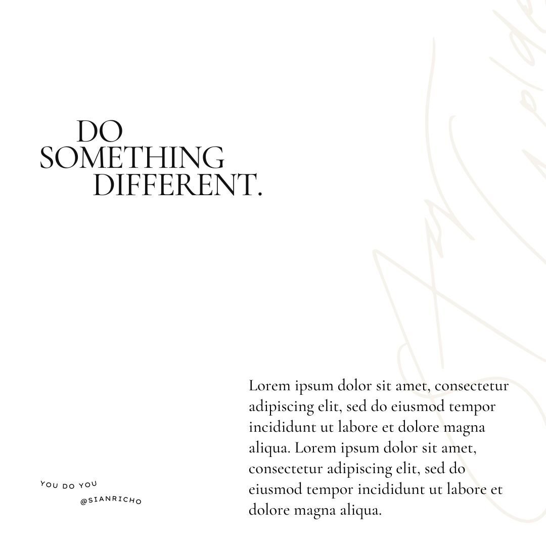
For example —
This piece (from the Goldie template pack), I very intentionally laid out those few pieces of content the way I did. First your eye is drawn to the large heading on the left, and then down to the text box on the bottom right. (And then likely back to the bottom left where the credit box is).
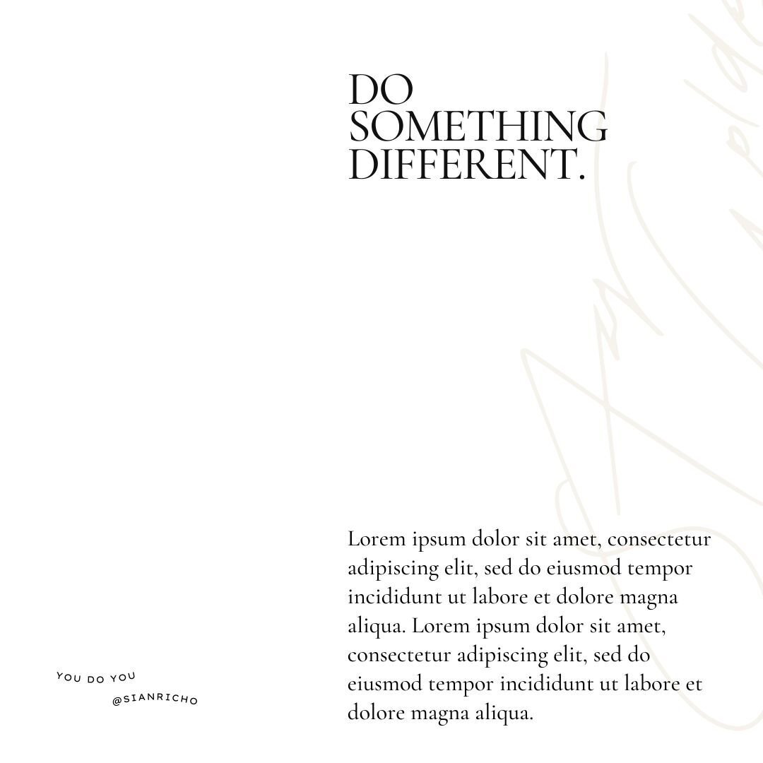
Now, here's the same design, and all I did was move the heading over to the right side of the page.
When you look at it, it just feels... off, right? It's because aside from the little tiny text in the bottom left, EVERYTHING is on the right, even the slightly transparent handwritten text in the background.
So sure, your eyes are still drawn to the same pieces of content, but the overall piece no longer feels right because there's such an awkward amount of white space on the left. Now, say we wanted to keep all the text where it is, if we just moved the handwritten text over to the left, that would help a lot.

Here's what that looks like...
I don't hate that, and it looks WAY better than the #2 version, yeah?? It just has more balance and flow to it. We are also factoring WHITE SPACE, and ALIGNMENT, which are my two other point's we're gonna cover.
Tip #2 / White Space. Have some.
I hate to break it to ya — but your designs are not going to make anywhere near the impact you want them to make if you cram in a bunch of useless info and photos and shit, so much so that there's zero white space to let any of the content BREATHE.
White space = the NEGATIVE, BLANK space around the content.
First thing you gotta do — cut out everything that is not needed. Review the copy and ask yourself what can be cut back, what is the point of this piece of design, how much space do you have to work with, etc. This goes for literally anything, whether it's an Instagram carousel, or a new section on a website page — everything needs white space to help draw the eye towards the content that is actually THERE.
Here's what I mean —
So I have this print on my wall I brought from a photographer in Canmore...

(Martini Bear, by Brandon T Brown)
The second I saw this print in the studio, I had to have it, because I just fell in love with the composition of it, and all of that white space around the bear. BECAUSE of all of that blank space, your eye is instantly drawn to what IS there — the bear and it's lil fishy.
The exact same thing applies to the world of design.
When there's too much going on, you don't know where to look, and you will likely give up and move on, or not really 'take in' what you are looking at. You probably do it all of the time without even noticing it, when you are seeing posts on Instagram, or reading food packaging in the supermarket, or passing by a billboard... design is everywhere. And more noise + more content doesn't make any of it any better or easier to look at, right? So, we gotta dial it back a little.
Here's an example of a template that has a LOT of white space —

And here's the same design, if I was to fill that whole white space with text...
TOTALLY different vibe, yeah? Notice how you don't know where to look when you first look at it? Now of course it depends what the goal of the piece is and all of that shit, but you get my point. Always always have white space in your designs — especially the ones where you want to make a statement or say something important.

Tip #3 / Align, align, align.
No, we're not talking the Lululemon kind (as much as I love 'em).
When we talk about alignment in design, we want to make sure that we placing elements into our designs and aligning them with each other — whether it's vertically or horizontally. This really isn't hard at all, but it will totally change the profesh feel of your designs instantly.
Having random elements placed all over the shop is a visual shit show, and it also just doesn't look good, it looks messy and unintentional.
The other thing about alignment is that you essentially create invisible lines that aren't really there, and it gives the overall design a lot of structure that isn't obvious right off the bat to anyone looking at it. Overall, it just helps shit feel way more CLEAN. And we're all about that.
Here's an example —
So you can see all of the white text is aligned with the LEFT EDGE of the white box. This is how it should be — it looks neat and tidy and clean, yeah?

And this is how it should NOT look...
The white text is all over the place, and it's not aligned with anything, not even each other. If the 3 blocks of white text ('a note from...') were aligned with EACH OTHER, it would be a lot better, even if they weren't aligned with the white box.
