Let's break down some fire pieces of design.
A couple years ago I did this mini series here in my emails and on my old blog (which is no longer live) called What Makes Good Design, where I'd grab a few sick designs off Pinterest or Instagram, and break down why I think they work really well, and offer a couple take aways for you if you need some inspo or some design quick tips. So anyway, I thought I'd bring it back today for you!
I've chosen 3 diff pieces of design I LOVE, so let's take a look & break 'em down.
What Makes Good Design
Design #1 — Packaging Design

From The Dieline — "Aja Marie Johnson designed the packaging for Mamauki, a coffee house and creative hub based in Round Top, Texas."
I saw this piece pop up on my Pinterest the other day and I fucking LOVED it. I think that tall narrow background cream shape is so cool and unique for packaging design like this, and the repetition of that same label around the bottle is just 👌. You might have noticed in my designs, or heard me talk about it before, but using repetition as a design feature is something I really LOVE, even though it can be hard to pull off really well sometimes, but here it's really perfect.
Honestly I want to buy these just to put on display in my house because they're so sick, ha. 😍
Anyway, here's a couple take aways I can pull from this awesome piece of design...
You knew it was coming, but fuck around with some repetition in your designs. Even just duplicating background images is a really simple & easy way to start.
Keep it simple. I know its cliche but truly, the best designs that feel the most elevated & polished are very clean and simple. There's no huge fonts or crazy colours here.
What if you just used one single font? From what I can tell, the font (/typeface, lol, don't come for me designers), used across the whole label is all the same, which I really dig. Using it at different sizes and orientations means the hierarchy is still what it should be, so you're not confused where to look first.
Also notice, no use of colour here! Well, other than black obvs. See my Insta post from the other week on this).
Design #2 — Website Design

I'm a layout designer at heart, so most of my Pinterest and the shit I gravitate towards is stuff I really love the grid/layers/layout of, and this is one of 'em! It's so simple but I love the big full height colour block and the placement of the images.
A couple takeaways...
The white space here is total perfection. If you're not familiar, white space is the areas where there's no content, and it's SUPER IMPORTANT because it lets the content breathe and it also helps your eye flow through the design so much easier. It's really balanced from the top left, to the bottom middle, to the top right.
The tall pink block on the left with that image placement is also really nice. Specifically I dig how the middle image is right flush against the box, like its actually a layer behind it. I think a similar structure would be super fun to play around with in Squarespace too, now that there's so much more flexibility in there.
Design #3 — Website Design
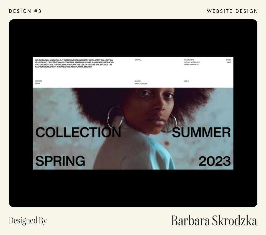
Again, I'm always just so stoked on creative layout designs, and this one is another one with really solid use of white space. Although, I would say, considering it's a website design, I'm not totally sure on the hierachy of the content. Imagine you're viewing it at 100%, there's a lot of small text at the top with bigger stuff down below, so I think your eyes would be darting all over the place a bit.
BUT here's what I like, and what I might try to do differently...
Again, love the white space here, especially that big chunk of white at the top. I think its a cool way to design the top of a website, especially if a short tagline is on the left that clearly explains what you do. Make it obvious, and make it easy to read.
Here's what I'd do — Keep the tagline in the top left (a bit bigger & much shorter though), with a menu & other shit (kept very minimal), on the right. I'd ditch those small lines/links right above the image, and I'd make the image a lot taller and move that large text 'below the fold' (a term I honestly hate lol), so you can't see it until you scroll down, that way it doesn't distract from the tagline and the content at the top.